5 Strategies for a Great Landing Page
We’ve talked about how just having a website for your business can increase your legitimacy in the eyes of consumers. Adding landing pages to that website can be a great way to drive calls to action, converting traffic to your website into sales, leads, and customers.
However, nearly 57% of users say they won’t recommend a business with a poorly designed website, so here are five strategies you can use to create attractive, well-designed landing pages to meet your goals!
Benefit-Focused Headlines
Unfortunately, the popularity of click-bait articles has aided the fact that many people will not invest time into reading an article or website page if the title is not engaging. That’s why the headline is your best chance to capture your audience’s attention. Having a benefit-focused headline that conveys the objective or benefit of the landing page is more likely to convince someone to stay on the page.
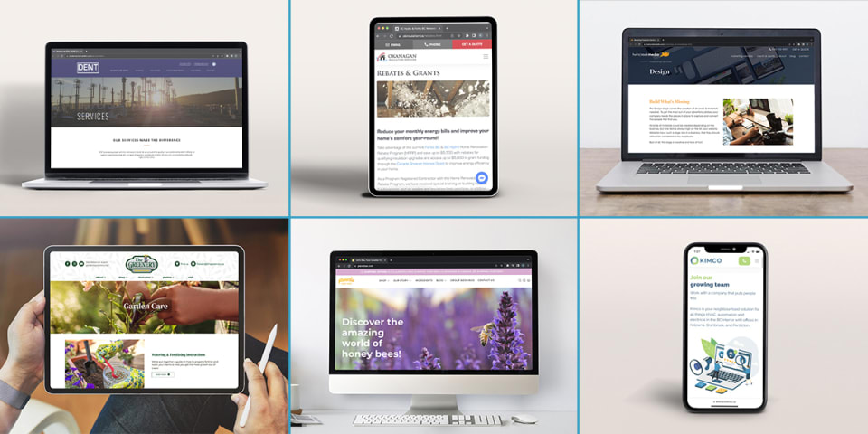
Rich Media
While the text is the crux of the information you’re trying to get across to your customer, nearly 65% of people better retain information when paired with images. Including images or videos that highlight the value of your business can be a huge advantage! You can also consider including moving GIFs, videos, or interactive images to make your landing page stand out. However, make sure that the images do not distract from the overall design – you want to entice your user to download your content over, not overwhelm them with dozens of images battling for attention.


Clear & Obvious Call-to-Action
When a user comes to a landing page, you want them to do something – so be specific about what that is! Replace those “submit” or “click here” buttons with engaging copy like “Get my free trial” or “Send me the PDF” so users are 100% sure about what they’re getting into.
Additionally, consider colour and placement with your call-to-action buttons. Marketing companies have been using colour theory for ages to make the call-to-action button contrast from the rest of the landing page so it stands out and your audience’s eye is drawn to it. Consider what colours will work best for your business.
Remove Navigation Panes
Once a customer is on a landing page, you don’t want them moving away! Removing the navigation panes so there’s no menu for a user to click away to can increase the likelihood of continued engagement - consider doing this if it makes sense for the content on the page. With a website builder, you can remove all other hyperlinked distractions, making the clear and obvious call-to-action button you’ve created the most intriguing way to move forward.
Keep It Simple
This principle is applicable in many ways on your landing page but is one of the most important to remember in business-to-consumer marketing. Whether it’s having a direct title, an obvious call-to-action button, or a plethora of white space on the screen, you want to make sure that you’re engaging your audience on the most important aspect of the landing page.
Along with this, any forms that you want users to fill out should also be simple. Only ask for the information you truly need at that moment, because you can always get more information from them when they become a customer later!
Teaming up with a web design company can make all the above even easier! Our experts in online marketing will ensure your landing pages work for you.
Want to know more about what makes a great website design? Check out our Design Marketing Services page.
Twin Creek Media is Kelowna’s marketing department, available to help you build your brand, pump up your social media channels, or refresh your website. Contact us today to discuss the growth of your company!